Asset allocation is a dial that you can use to adjust the risk and expected return of the portfolio up or down. And, for the most part, that’s it. Anybody who expects more than that — anybody who expects any magic (additional return without additional risk, or a reduction in risk without a corresponding reduction in expected return) from clever asset allocation — is likely to be disappointed.
Let’s use PortfolioVisualizer’s “backtest asset allocation” tool to show you what I mean. (Note that their “backtest portfolio” tool is also of interest, but it requires you to use specific funds, which often leads to a shorter period of data available.)
Let’s start with a basic Bogleheads-style “3-fund portfolio” of 40% total US stock market, 20% total international stock market, and 40% total US bond market.
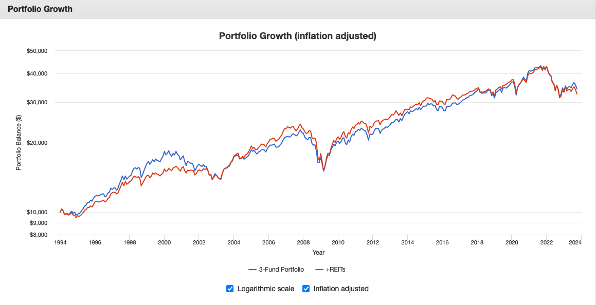
Here’s what happens when we substitute 20% of the total US stock market allocation with 20% REITs. (So now it’s 20% total US stock market, 20% international stocks, 20% REITs, 40% total US bond market.)
(Portfolio Visualizer link here.)
This is for the period Jan 1994 – Sept 2023 (because January 1994 is the earliest date for which Portfolio Visualizer has REIT data).
When I look at those two lines, the thing I overwhelmingly notice is how similar they are. Are they exactly the same? No. But boy they’re close. (And frankly this isn’t super surprising. We replaced stocks with stocks.)
No magic.
What if we use small-cap value stocks?
Here’s what happens when we substitute half of the total US stock market holding with 20% US small-cap value stocks, and then also move 1% from each of those two US stock categories into the bond fund, in order to adjust for the fact that small-cap value stocks are slightly riskier. (So now the portfolio is 19% total US stock market, 20% international stocks, 19% US small-cap value stocks, 42% total US bond market.)

(Portfolio Visualizer link here.)
This is for the period Jan 1987 – Sept 2023 (because January 1987 is the first period for which Portfolio Visualizer has data for total US bond market). Again, they’re very similar. If either portfolio is suitable for somebody, then the other portfolio would clearly be suitable also.
No magic.
What happens if we change the bonds? The chart below uses intermediate-term Treasuries instead of the total US bond market. And because Treasuries are slightly safer than a total bond fund, we’re adjusting the overall stock allocation up by 2% to keep roughly the same overall risk level. (So now the portfolio is 42% US stock market, 20% international stocks, and 38% intermediate-term Treasuries.)

(Portfolio Visualizer link here.)
This is again for Jan 1987 – Sept 2023, because January 1987 is the first period for which Portfolio Visualizer has data for total US bond market.
Again, nothing magical happening here. They’re so, so similar.
What about short-term Treasuries? Below is the chart if we use 43% total US stock market, 20% international stocks, and 37% short-term Treasuries. (Again bumping up the overall stock allocation ever so slightly, relative to the portfolio with intermediate-term Treasuries, to account for the fact that short-term Treasuries are a bit safer than intermediate-term Treasuries.)

(Portfolio Visualizer link here.)
This is again for Jan 1987 – Sept 2023, because January 1987 is the first period for which Portfolio Visualizer has data for total US bond market.
Overall, same conclusion.
Let’s do one last comparison. This time we’re using short-term Treasuries and a tilt toward small-cap/value. (The “comparison” portfolio is 21% total US stock market, 20% small-cap value, 20% international, 39% short-term Treasuries.)

(Portfolio Visualizer link here.)
I truly cannot imagine getting excited about the difference between the two lines on any one of these charts.
Admittedly, these were just comparison portfolios I came up with in a few minutes. You can test different portfolios for yourself. You could look at different periods. Some portfolios will look better than others.
But between two reasonable portfolios with similar overall risk levels, the return will generally be similar as well. Yes, one portfolio will always come out a bit ahead, but you can see periods where the other portfolio was ahead instead.
This is not to say that asset allocation doesn’t matter. But, at least in my opinion, it’s probably not worth spending a tremendous amount of time on — other than trying to figure out what overall risk level is right for you. Once you know that, there are plenty of different ways to get there. (I usually vote for whatever is simplest.)
And I would enthusiastically encourage you not to rely on any magic from having a clever asset allocation. (Asset allocation is a fruit salad, not a cake.)
“A wonderful book that tells its readers, with simple logical explanations, our Boglehead Philosophy for successful investing.”
– Taylor Larimore, author of